Project Overview
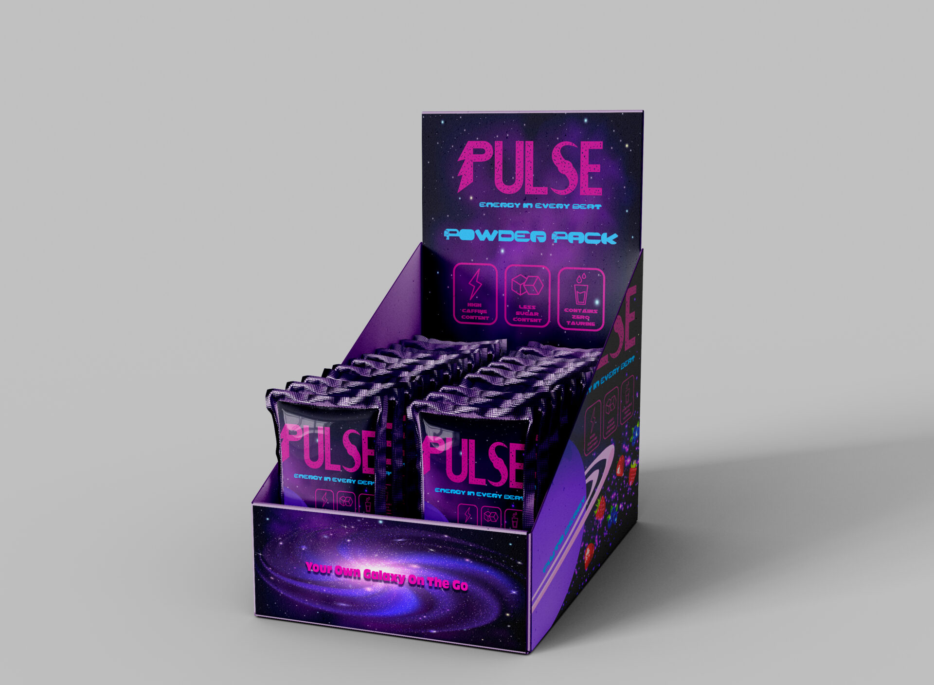
For this project, the goal was to design an energy drink brand and its package design. This energy drink is called Pulse Energy, a low sugar and highly caffinated sparking beverage. The theme for this drink is the galaxy. Pulse is more of a berry flavored drink line, since tropical fruits don’t really match the space theme. This energy drink does not contain taurine. That type of chemical is known to show side effects in certain individuals. This energy drink is targeted for anyone who prefers a non taurine energy drink, gamers, and individuals who need a boost before work or the gym.
Design Process

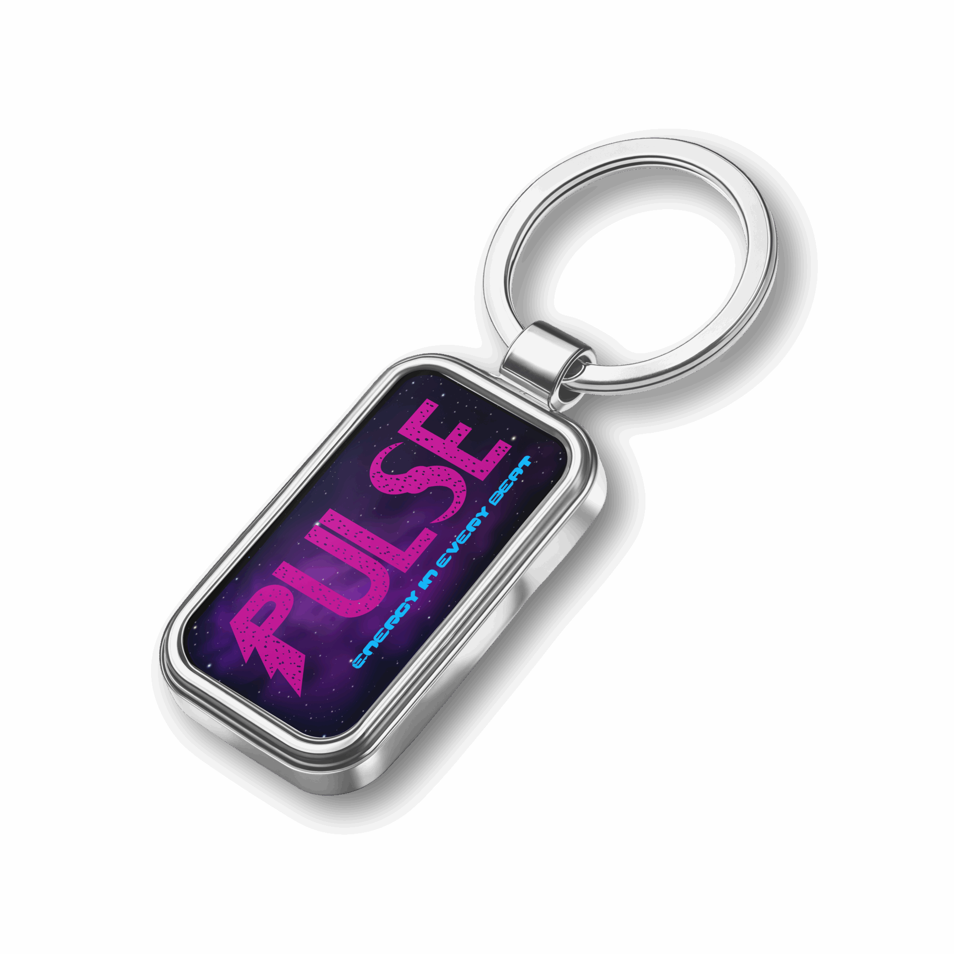
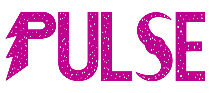
The name Pulse represents the “It works in a heartbeat” phrase. The letter P is a lightning bolt to also represent speed. The galaxy theme is shown through the swirl in the letter S and the font. Multiple sketches of the logo were drawn out before choosing a style that fits. For the can design, two different styles were required. Each galaxy sketch created different but similar ideas for the final two can designs.

Can #1 Background

Can # 2 Background

Wireframe

Wireframe
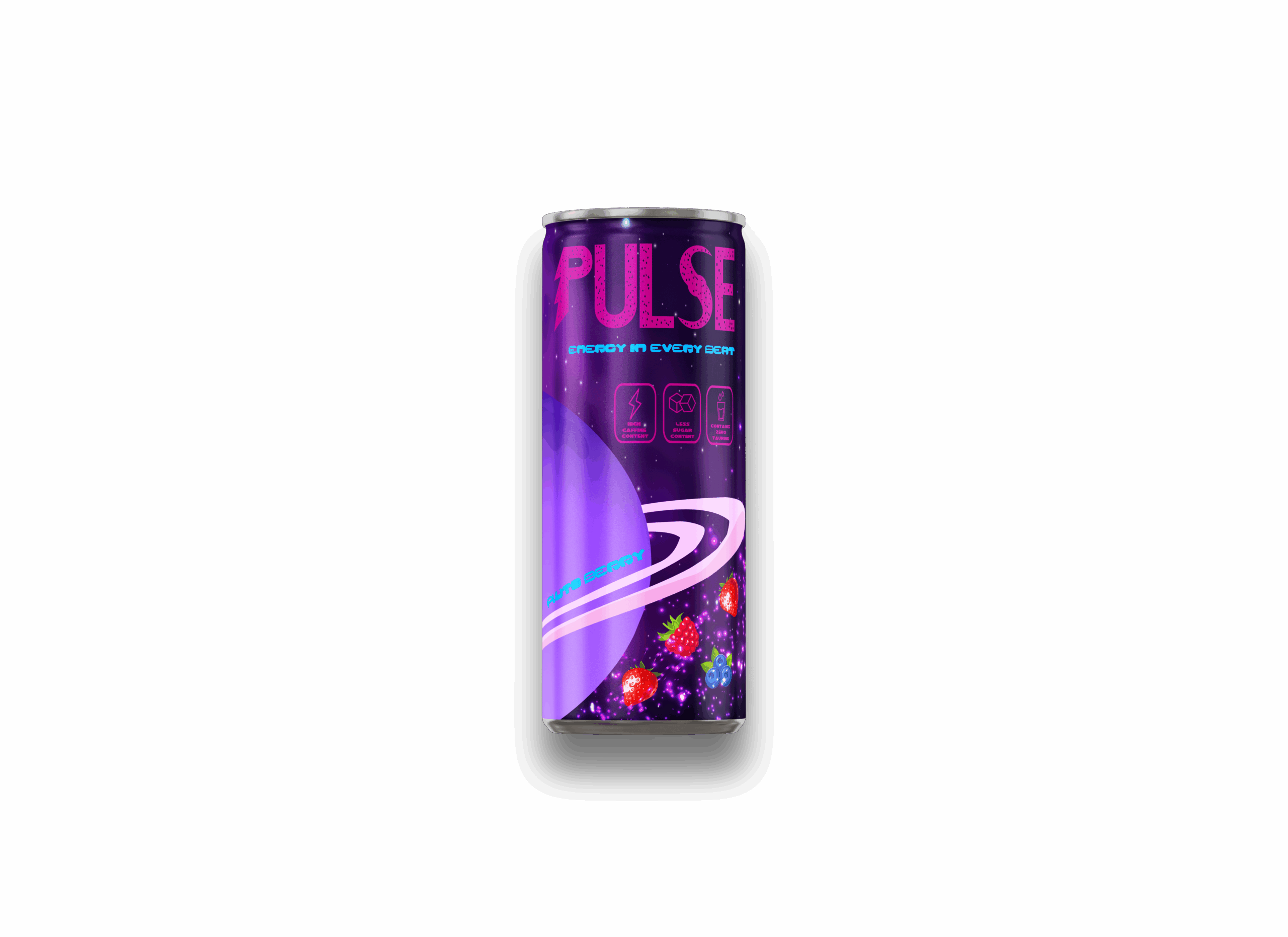
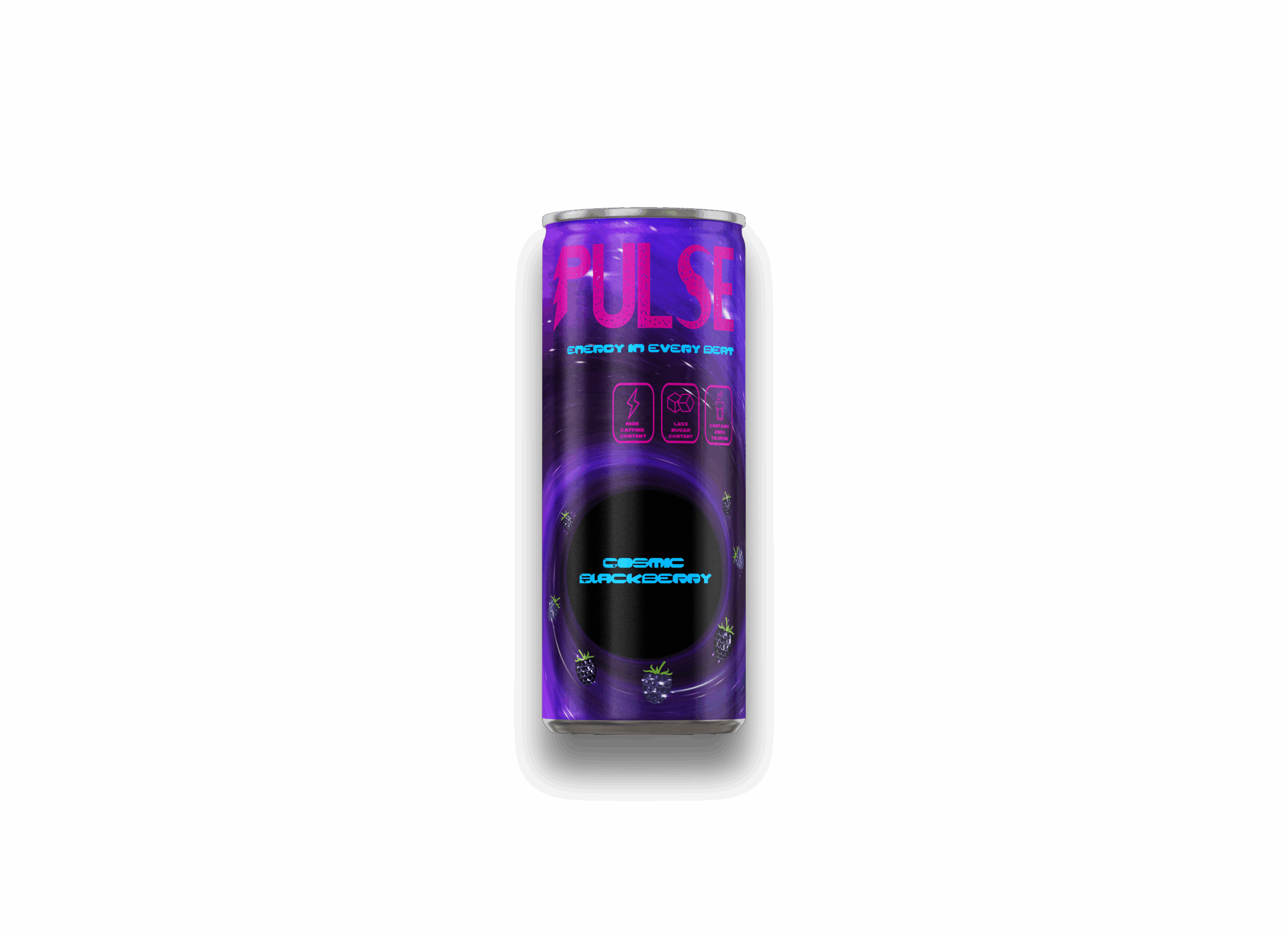
After the can designs are final, the wireframe for the label is created. Can 1 is on the left and can 2 is on the right. Can 1’s design is focused on the planets and stars. This is a berry flavor called “Pluto Berry”. The idea is for the berries to be floating in the stars next to the planet. The color pallete is pink, purple, and blue. Can 2’s design is focused on the elements that are found in space. The idea of the background was to have a black hole be in the center. The flavor of this can is called “Cosmic Blackberry”. The original name was suppose to be “Blackhole Berry”, but the name didn’t sit right in terms of grammar.

Can #1 Final Design

Can #2 Final Design
The two package designs present a bold and creative brand concept through the use of a cosmic theme and vibrant colors. The bright pink typography and the tagline “Energy in Every Beat” help reinforce the idea of energy and movement while making the brand visually memorable. The Cosmic Blackberry design appears more sleek and focused, using a swirling galaxy to draw attention to the center and highlight the flavor. In contrast, the Pluto Berry design is more playful and dynamic, featuring a large planet and floating fruit that create a sense of motion. Both designs are visually engaging and successfully communicate a modern and energetic brand identity while maintaining a consistent theme across the flavors.
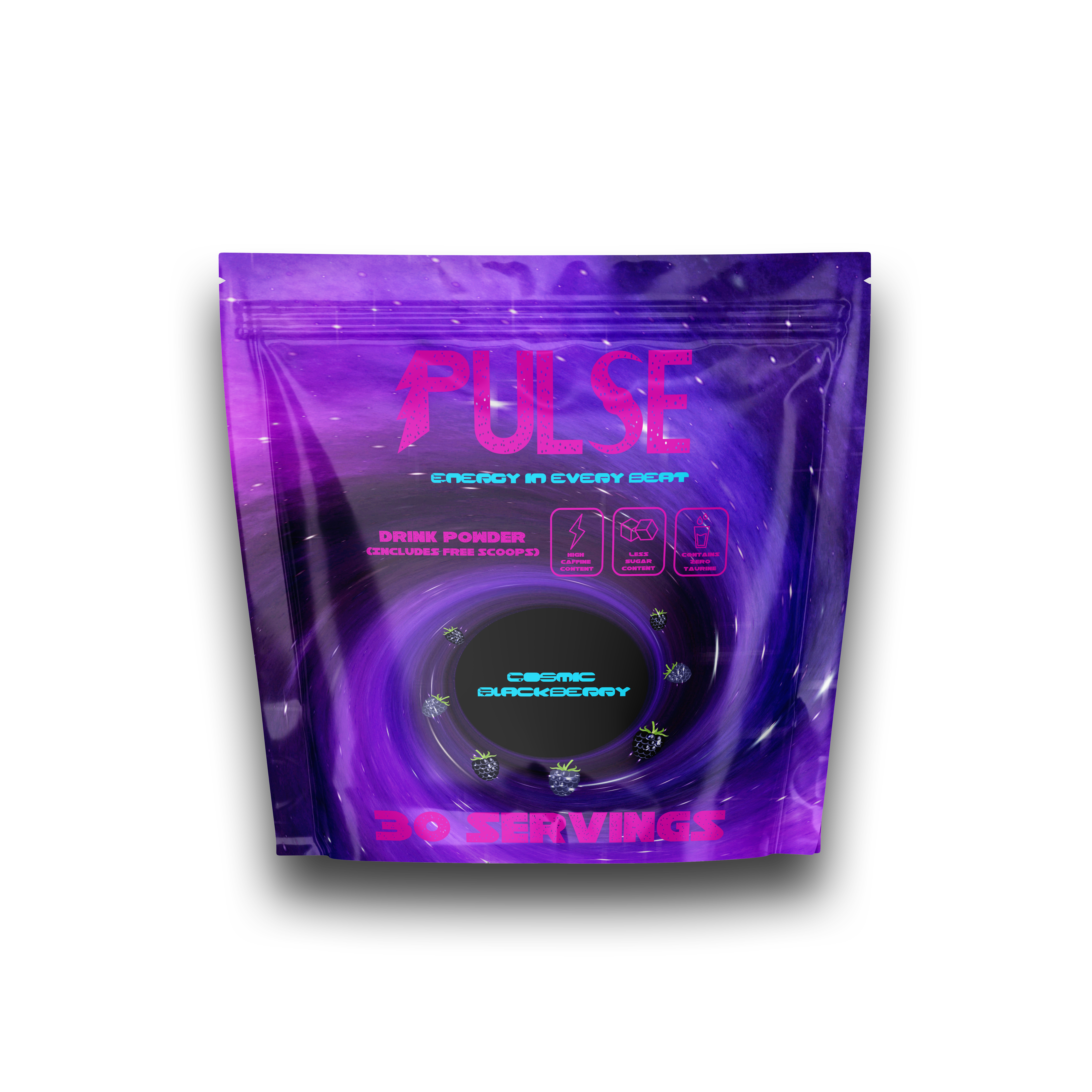
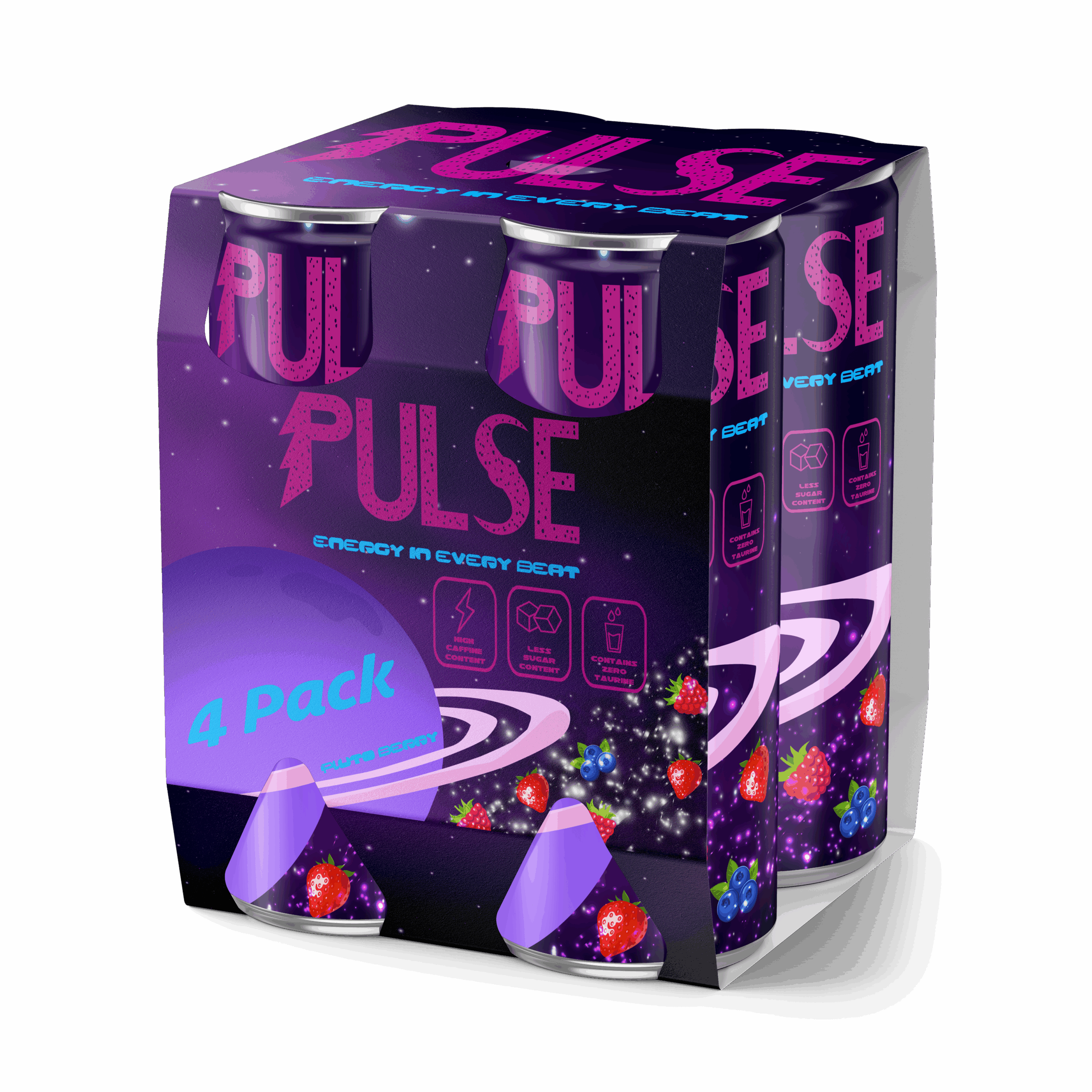
Final Can Designs & Mockups