Coffee Shop UI/UX Project
This is a Coffee Shop Rebranding case study for my UI/UX class. For this case study, the coffee shop we chose is called Cafe Tempo. It is a coffee house in Warwick, Rhode Island. They are known for their best homemade bagels, coffee, and espresso.

Commercial Coffee Competitive Content Audit
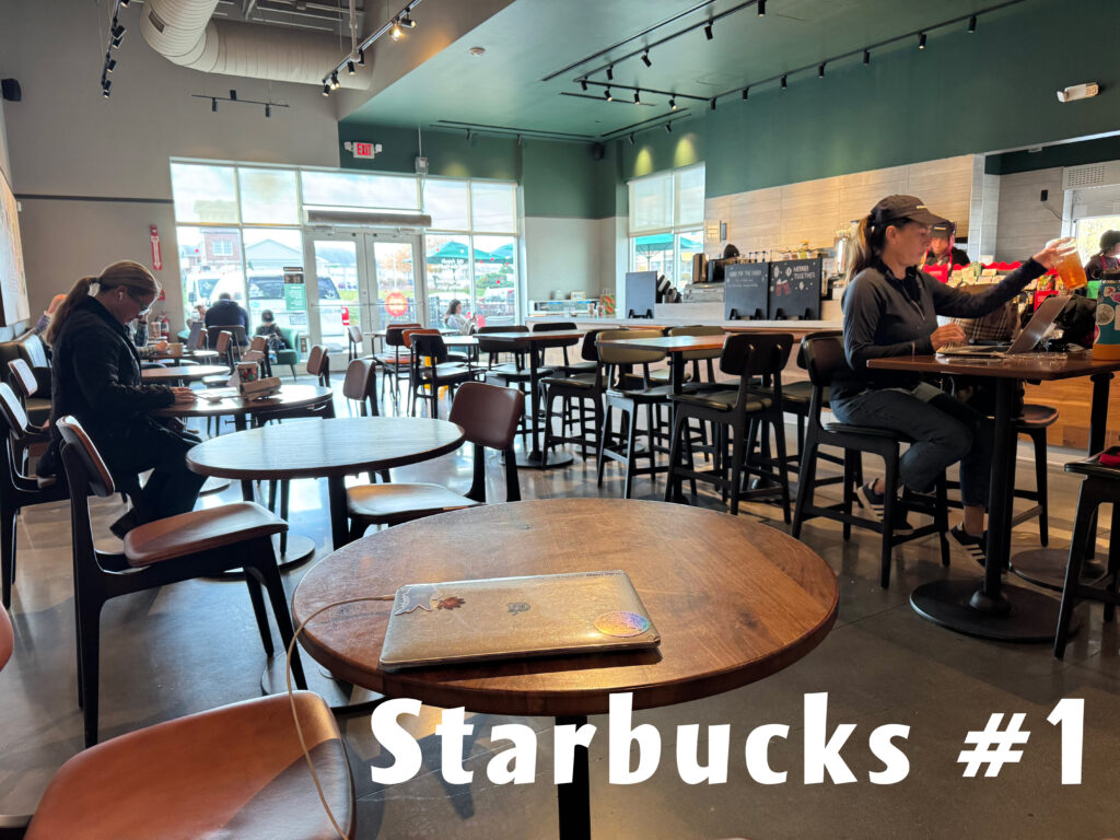
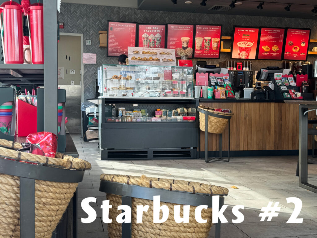
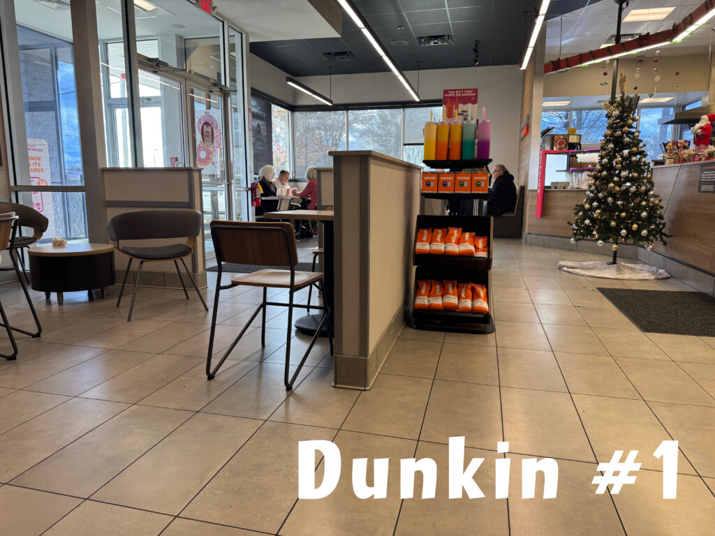
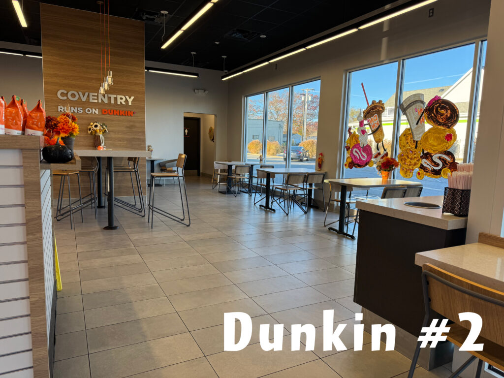
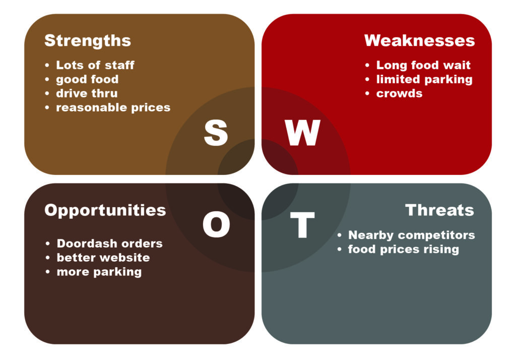
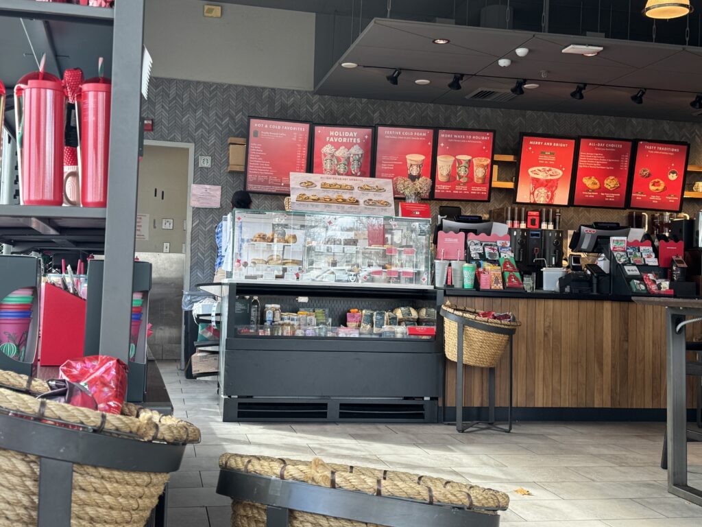
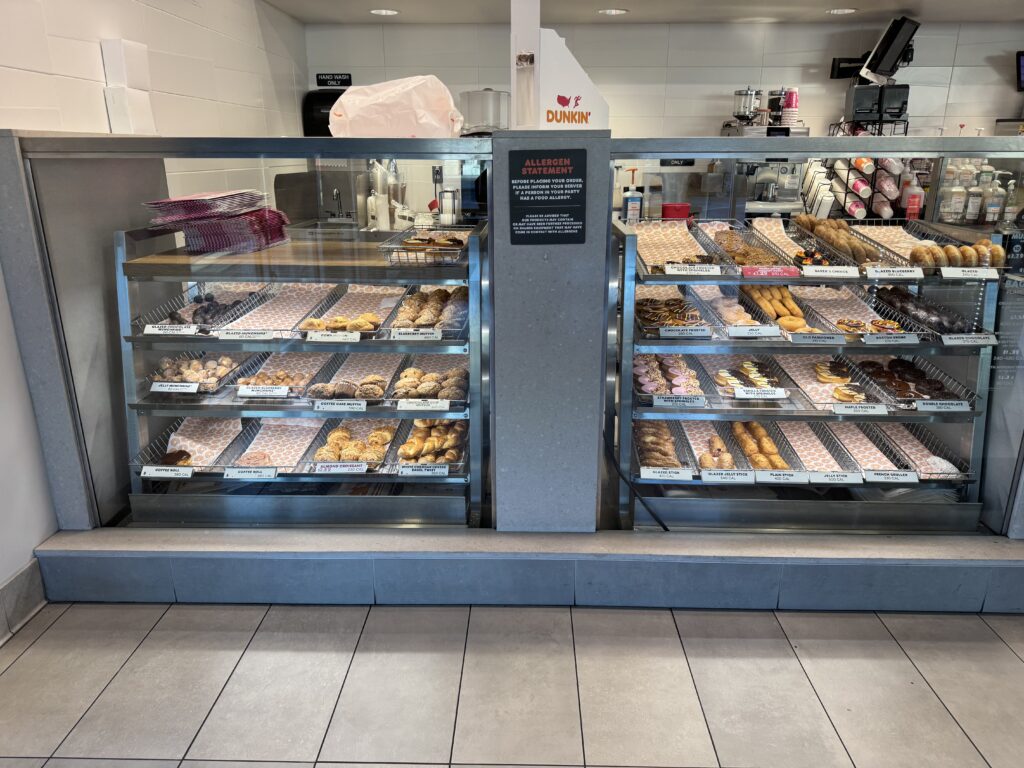
Before rebranding the coffee shop, we compared two popular coffee shop chains; Starbucks and Dunkin’ Donuts. Both chains have different customer experiences. To analyze the differences, we visited two different locations of each chain
to research the user experience on successfulness and downfalls. This research helped me compare the strengths and weaknesses of each coffee shop chain.
Commercial Coffee Competitive Content Analysis
Target Coffee Shop Content Audit
Cafe Tempo’s target audience is for anyone who loves a good breakfast in the morning or wants to grab a coffee and go. The buildings that are next to café tempo include a medical center, a chocolate store, a funeral home, and an animal hospital. Café Tempo can be beneficial for any employees grabbing some breakfast before their shift or grab lunch on their break. The café is open from 6am-3pm, so people can only get breakfast and lunch there.
Cafe Tempo has a lounge area to sit in or work, while not having a lot of space for a thousand tables and chairs. They also have a small bar area to sit at. Overall, the cafe is not very spacious.
An excerpt from their mission statement: “We believe by offering consistent quality food, at a reasonable price, in a friendly & inviting atmosphere which meets the needs of people looking to unwind and relax as well as those that are on the go, we can achieve our mission” (Café Tempo Website).
Before Cafe Tempo, the cafe was called the bagel factory. It was owned by Thomas Buontempo, a bagel manufacturer and Italian baker for the past 18 years.
The Bagel Factory suffered an unfortunate fire on July 6, 2013. Tome was able to take some time to research his business and decided to make some necessary changes during renovation and re-creation of what is now Cafe (coffee) Tempo (time) Coffee House.
The inception of Cafe Tempo Coffee House was created to offer a better atmosphere that is inviting, relaxing and fun. “Come in, relax, and feel at home, where our house is your house” (Excerpt from Cafe Tempo’s website).
Logo Evolutions
Logo Merch
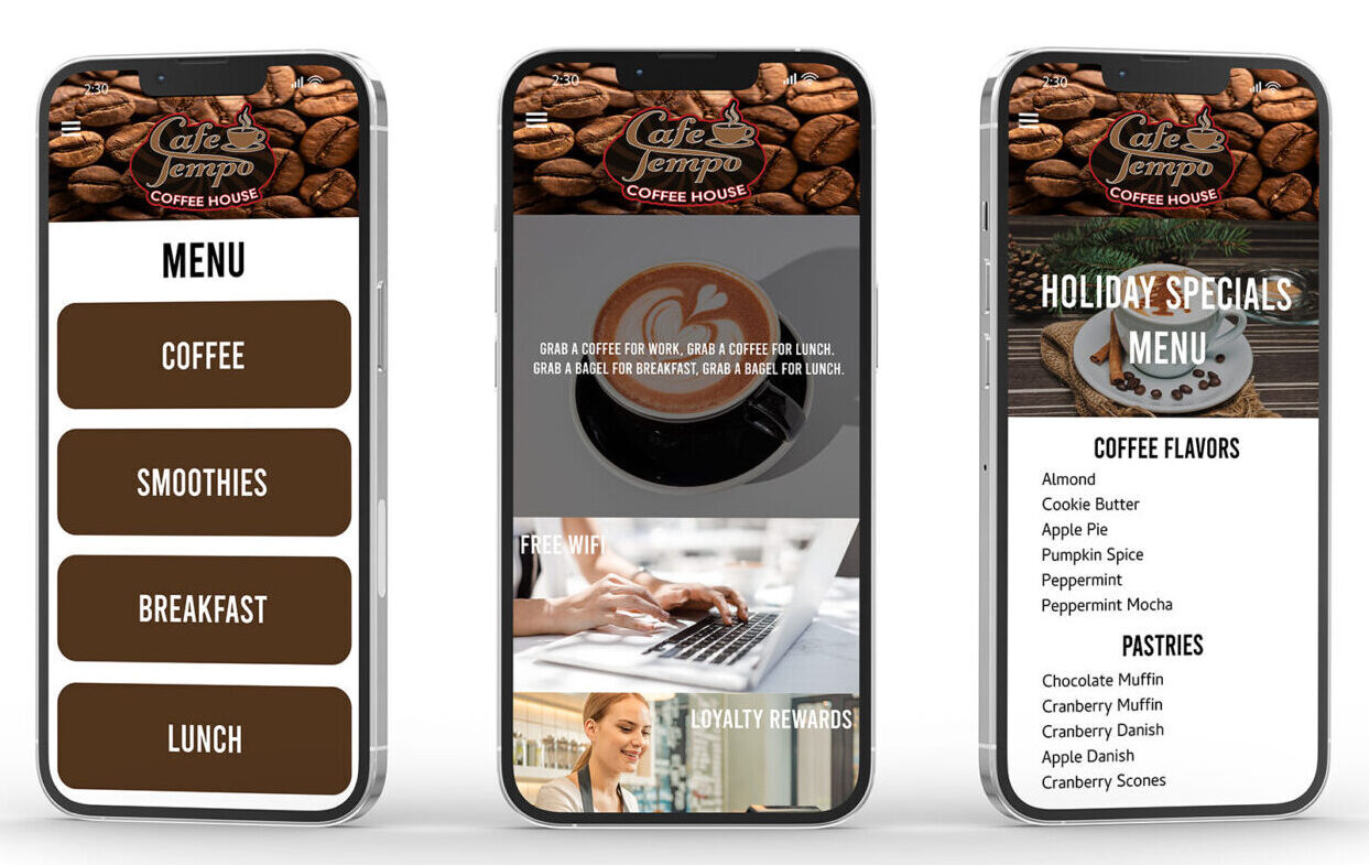
Mobile Interfaces
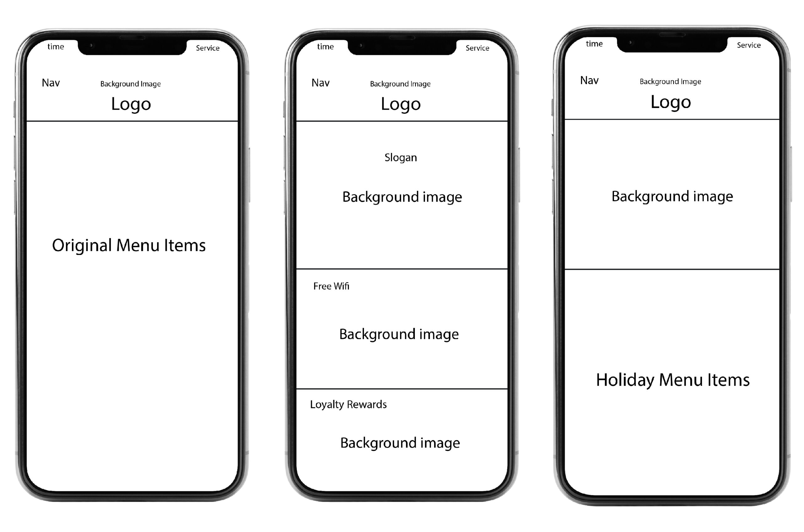
Wireframes
Final Interfaces
